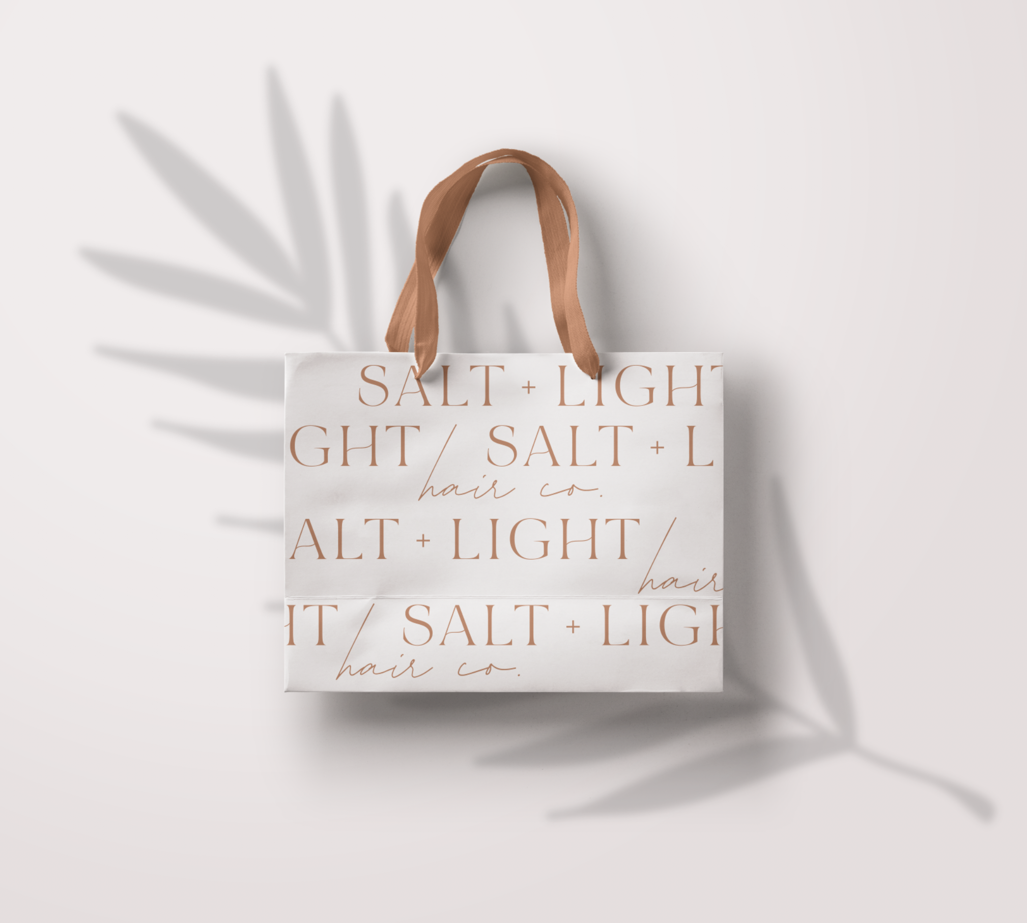
Some other fun options I came up with that didn’t quite make the cut but I still loved them! Branding for Salt and Light hair was so much fun because it was in allignment with my own style right now. When a client and a designer are a perfect match magic happens and everything about…
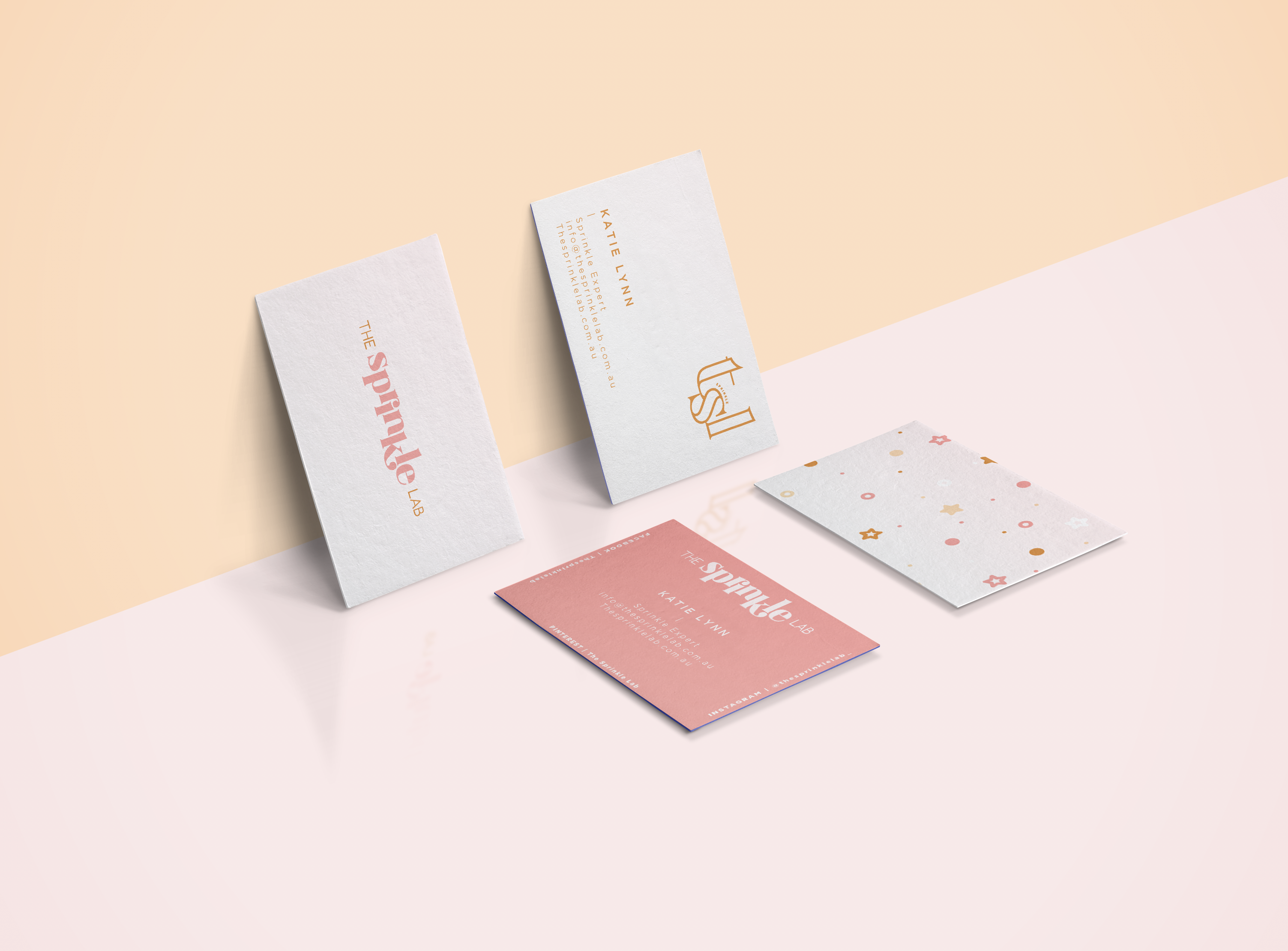
The Sprinkle Lab was such a fun project. It had color and spunk and so many fun ideas bursting from me! I love posting all of the options because I feel like my process is what makes branding design so much fun. This one made me so happy and I am delighted to share it…
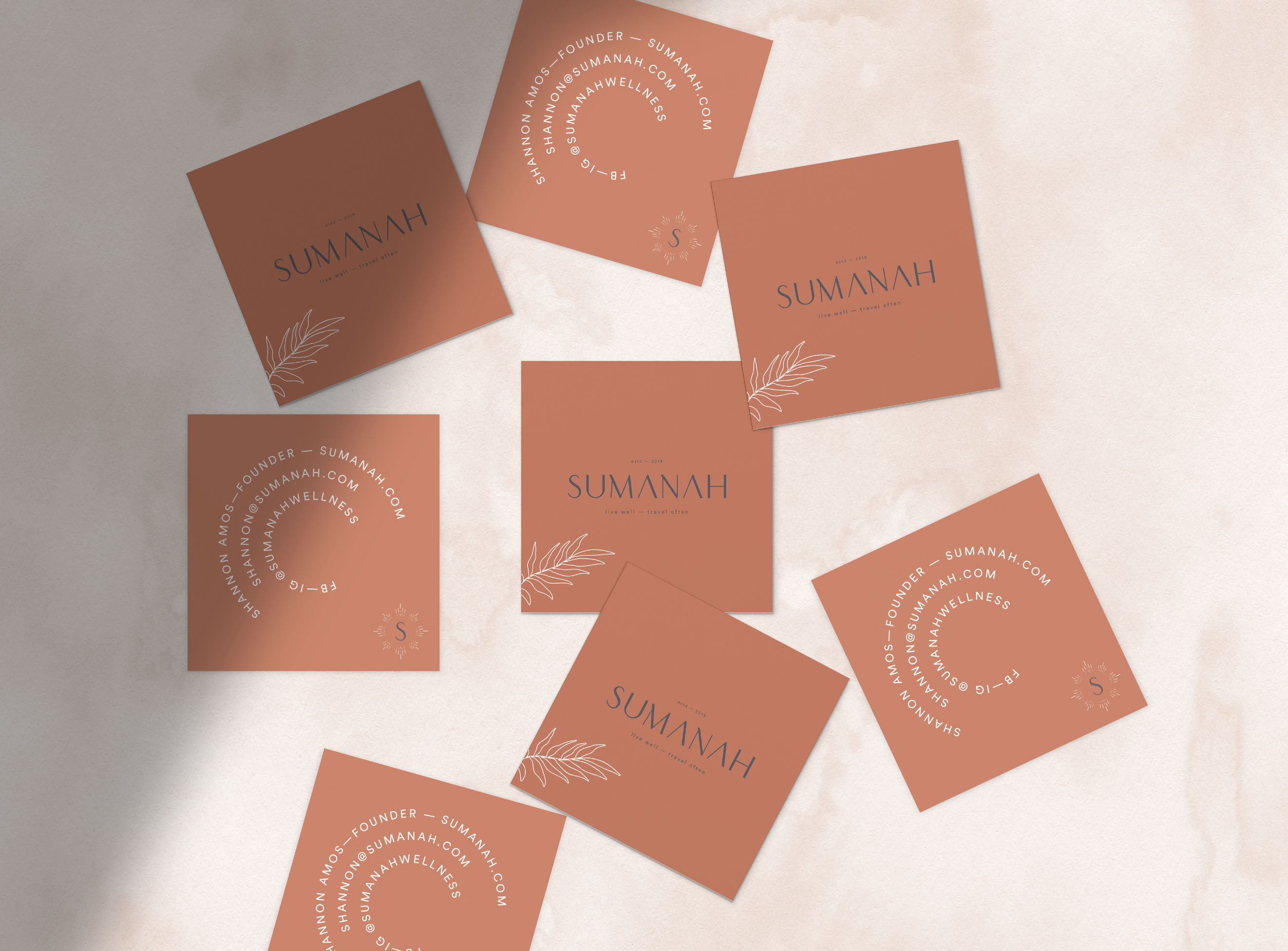
I can’t even begin to tell you how much fun working on this project was. It was my first job back from maternity leave and I really needed a creative outlet after three months away from design. This brand has an organic travel vibe that is so soothing and comfortable. We wanted something unique but…
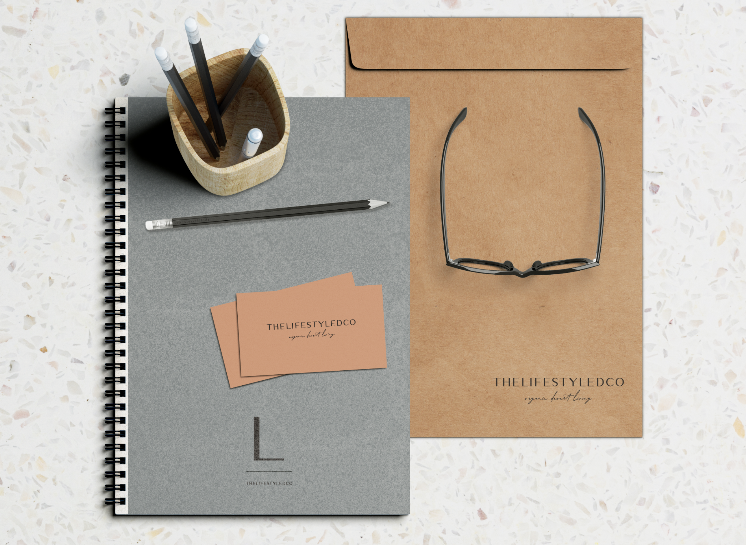
This interior design firm was a dream to work with. They wanted an organic desert styled color palette was so fun to come up with. We chose rusts and nudes for our summer and overal palette and then added in some cool dusty blues for a winter palette. But all of these colors work so…
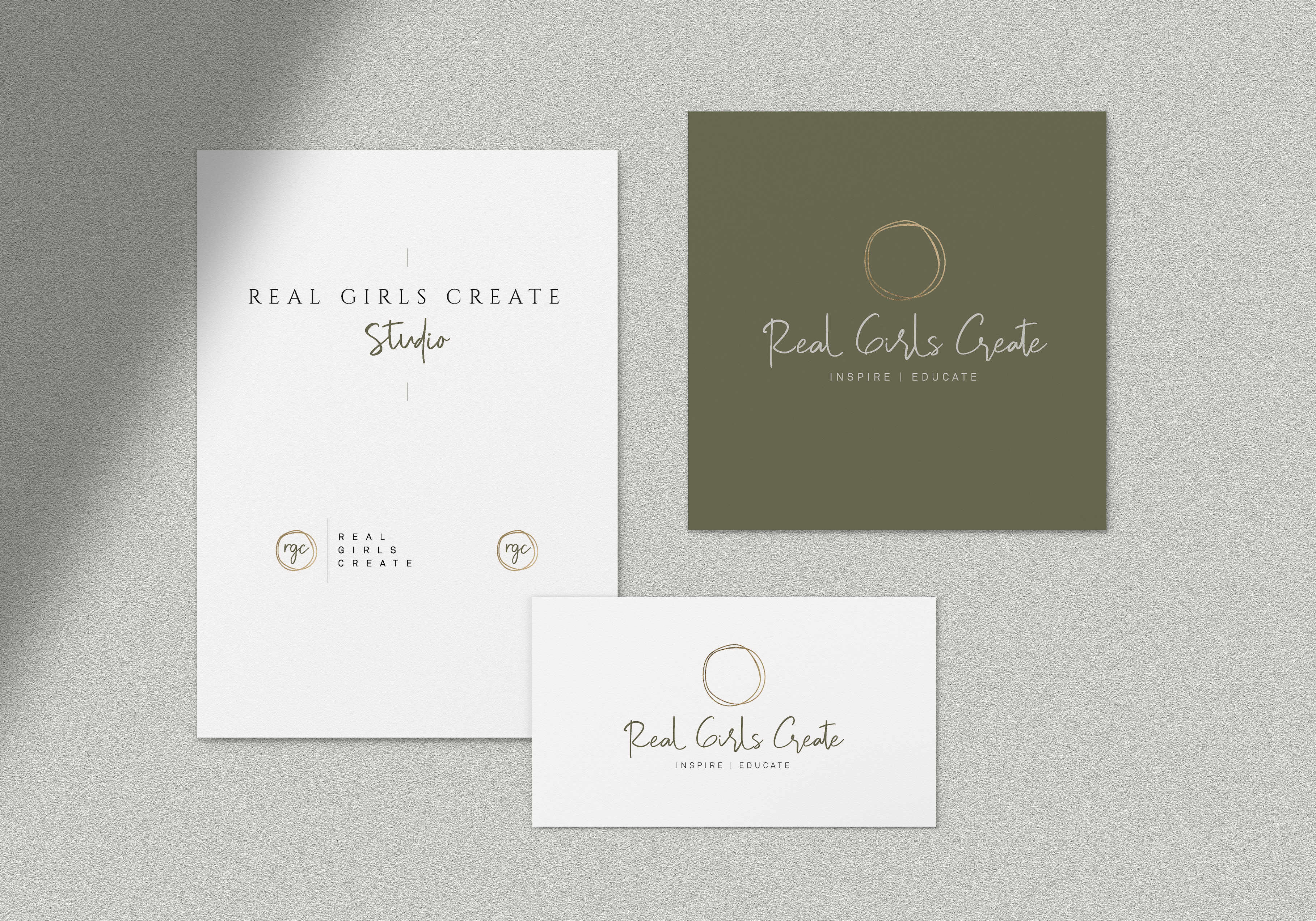
This branding was such a fun experience for me because I got to be really creative and use a color palette I don’t get to use often. The olive green was such a pretty touch to this inspirational brand. We did two logos that went well together for each sister company and then two accompanying…
Hi! So ya I’ve been out for a while but I am ready to post a bunch of my recent projects. This one was for an amazing jewelry company based in Europe who is launching soon! Woohoo! We ended up doing a bunch of variations until we ended up with this one and I love…
My Giveaway Winners Branding!!! I LOVED doing this project because I had so much freedom to do what inspired me. She wanted a variation of fun fonts and a simple floral/greenery element and these are the fun options I came up with. Doing branding never gets old for me. I love seeing how a great…
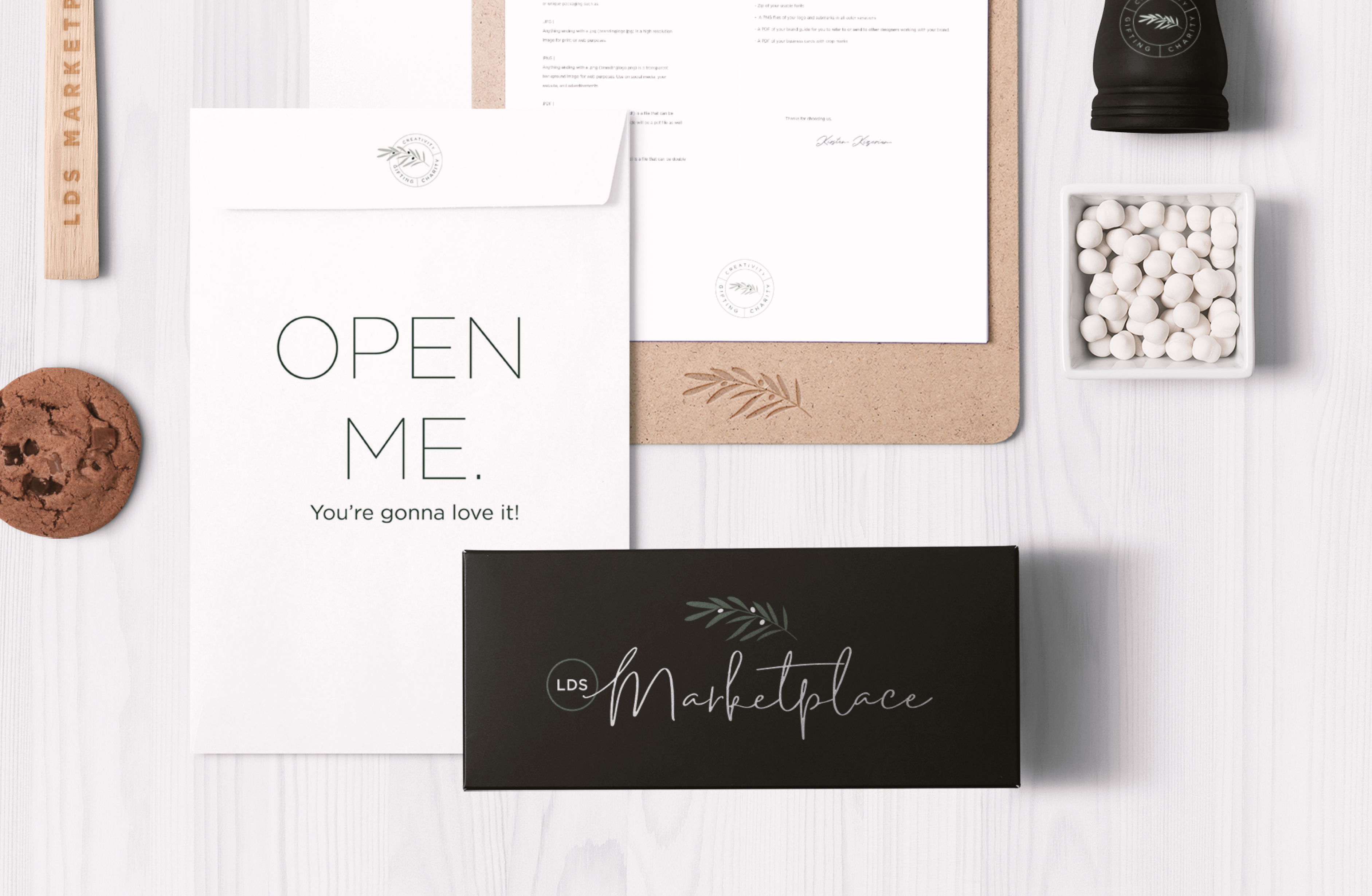
LDS Marketplace is an online farmers market of handmade & homemade goods. The goal was to design something that was friendly, organic and incorporated their three main elements, creativity, charity and gifting. We ended up doing an olive branch with three olives to represent those three attributes. I’m really excited to see where they go…
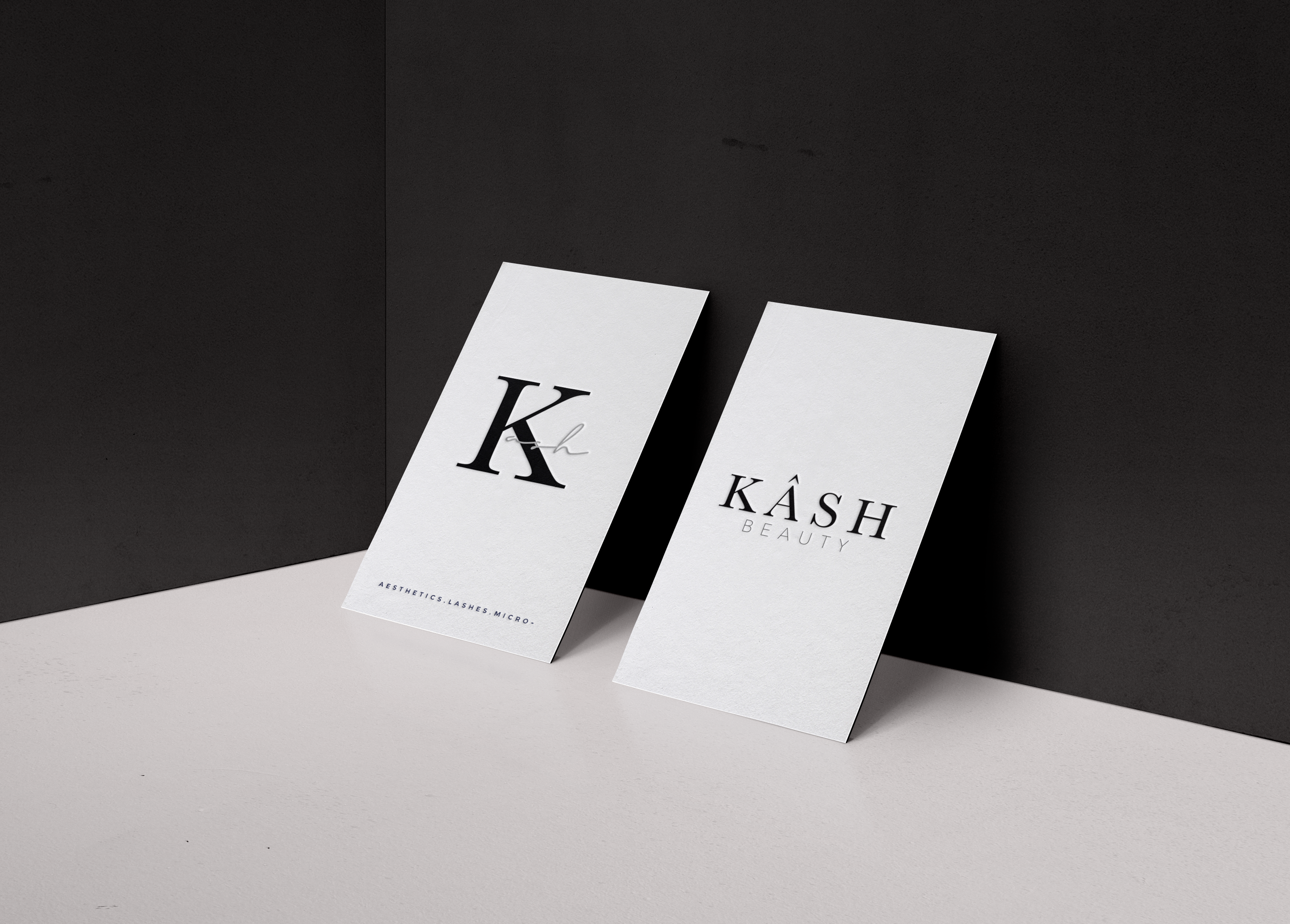
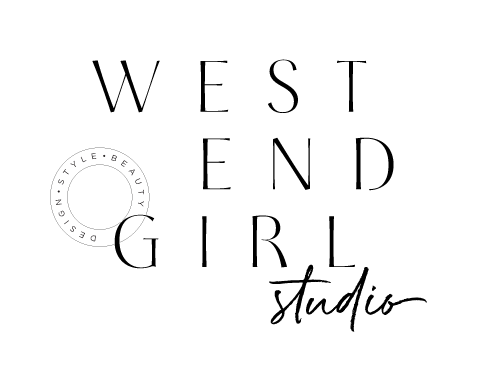
This project was for a beauty brand created by an amazing esthetician. She wanted something that resembeled a makeup label with the simplicity of a minimal color palette. I think overall it turned out exactly right for her brand. When doing makeup inspired branding, I think using the color black is very important. It gives…
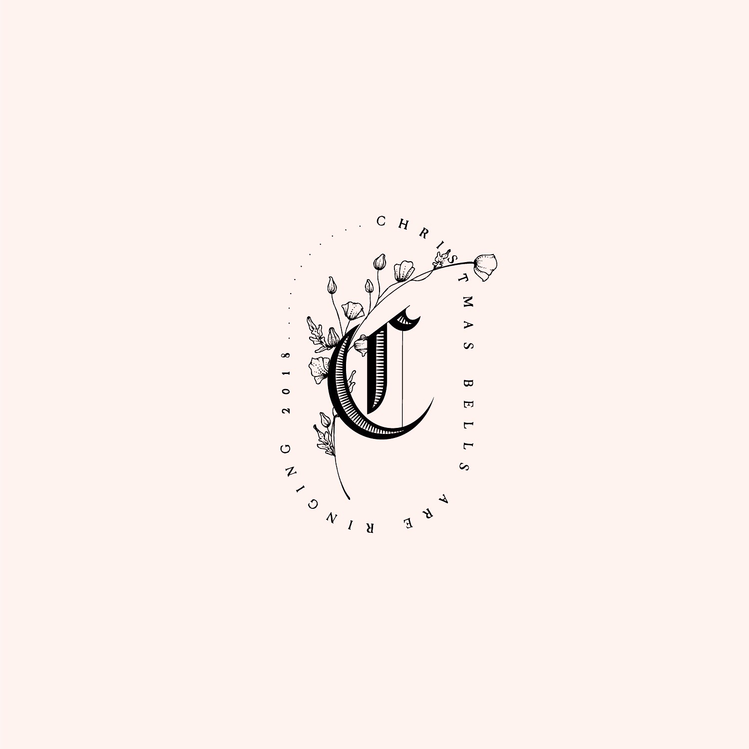
This one ended up looking Harry Potterish but I’m not going to complain. Here is the logo mock-up I did to show how these fonts can be used. I always like giving myself a new challenge, and this one was no different. I have always loved the intricate details of medieval inspired fonts but…