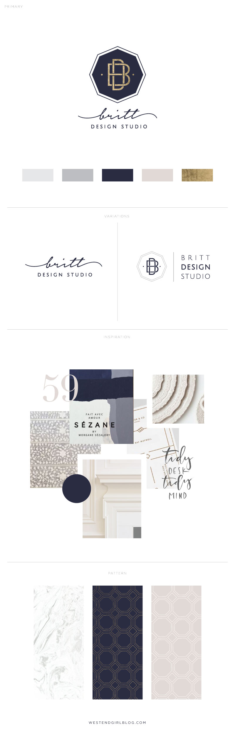
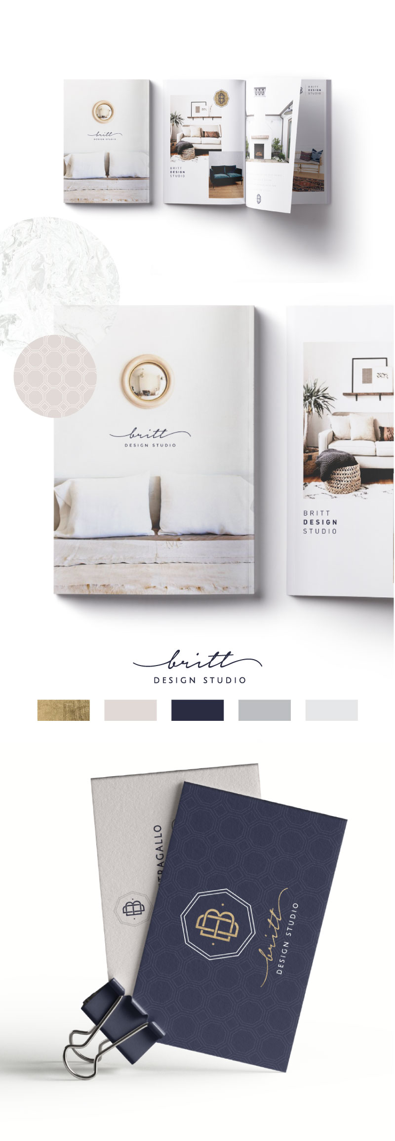
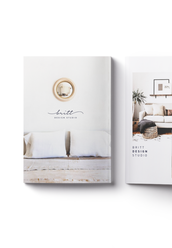
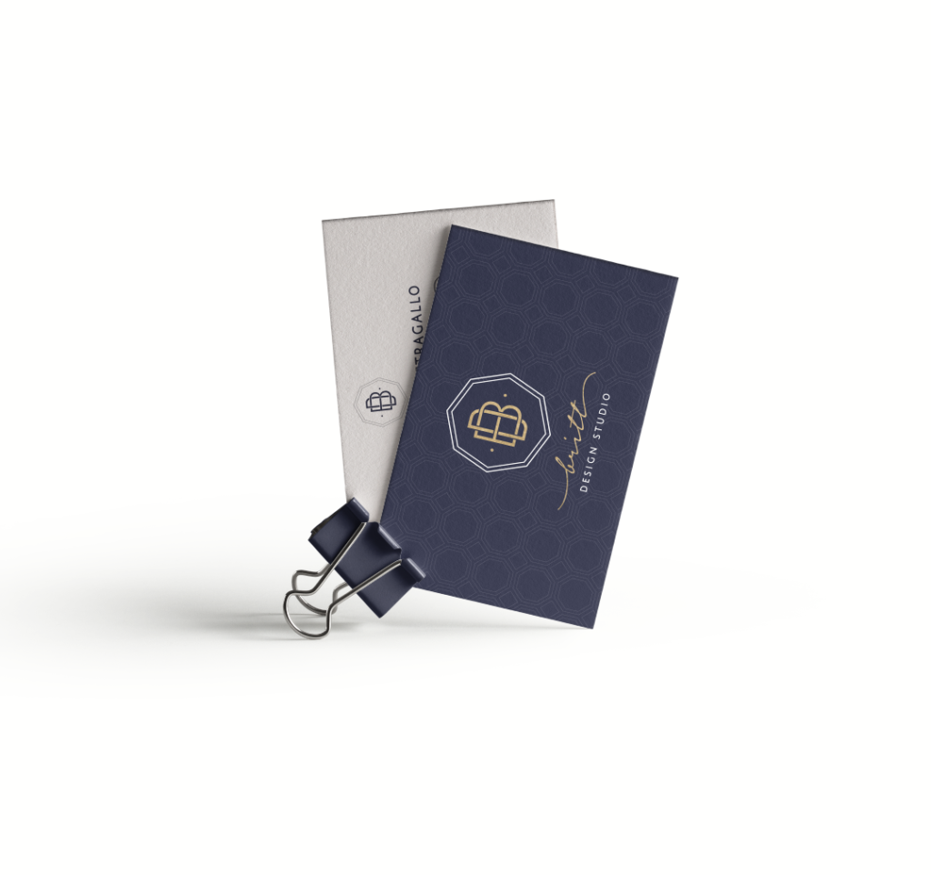
This branding project was for a interior design studio in NYC. She was very specific (which helps me a ton), with what she wanted so I feel like we came to a great final solution for her and her brand. She had a color palette in mind and wanted to keep the brand very classic and simple with a mix of a stylized font and a clean modern font.
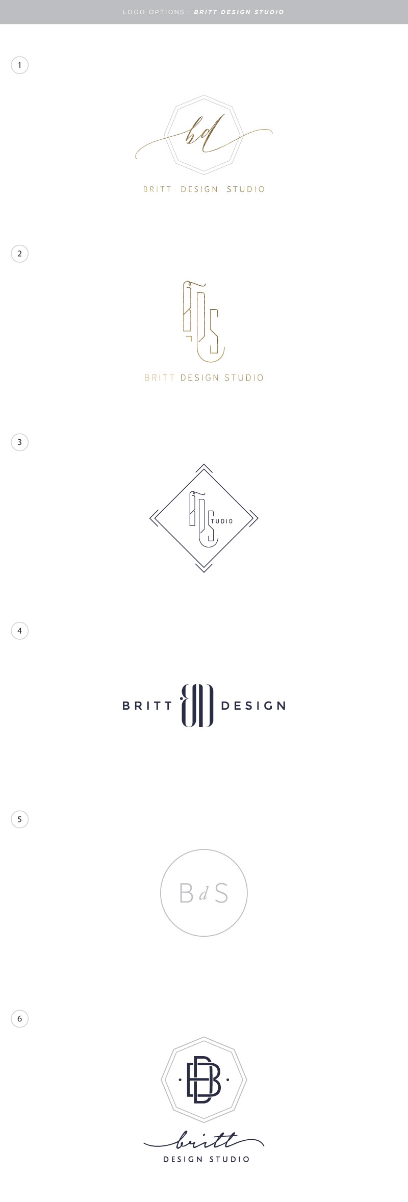
When working with a designer, make sure to have some inspiration and ideas of what you DO like before you start the process. There is nothing more painful and more expensive than not being prepared when working on your logo. Some people say, “I’ll know when I see it,”. The only problem with this thinking is that you will go through so many more options which equal more money, before you figure out what you like and don’t like. However, I do think options are important. I like to give my clients at least three options per round within the parameters they have outlined for me.
As a designer, it is important for me to steer the project since the client has probably never done branding before. How I do this is by sending a questionaire before we get started with questions like,
What are you expecting to see? (handwritten, texture, watercolor..)
What are three words that describe your business?
By asking these types of questions, I can narrow down styles, fonts and colors that are fitting options for the project rather than just using my own idea of what it should be.
Feel free to ask any branding questions below and I would love to give you more feedback!