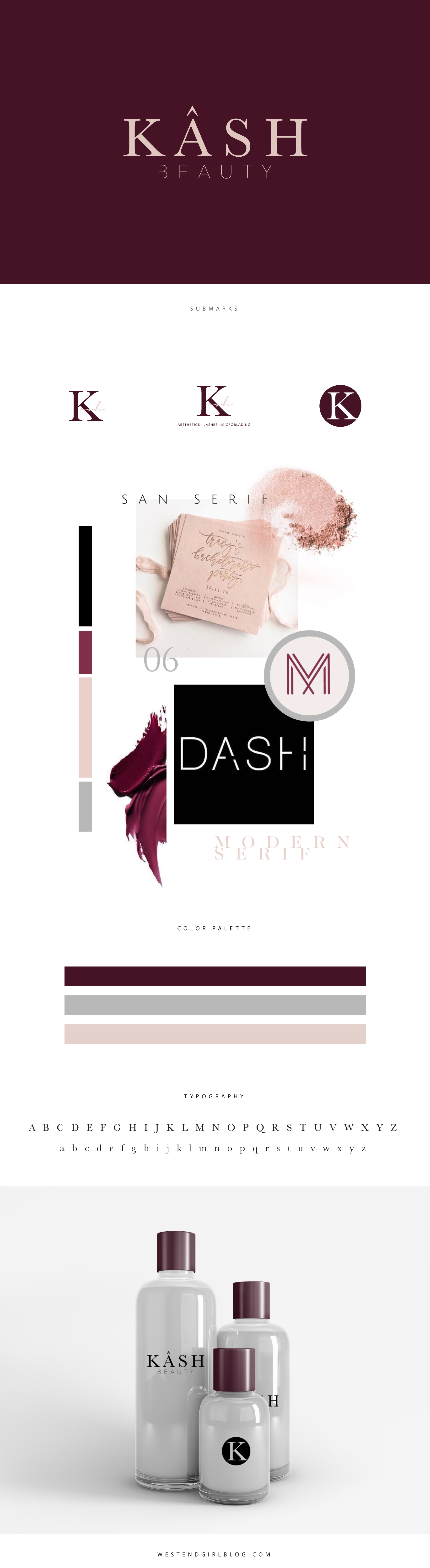
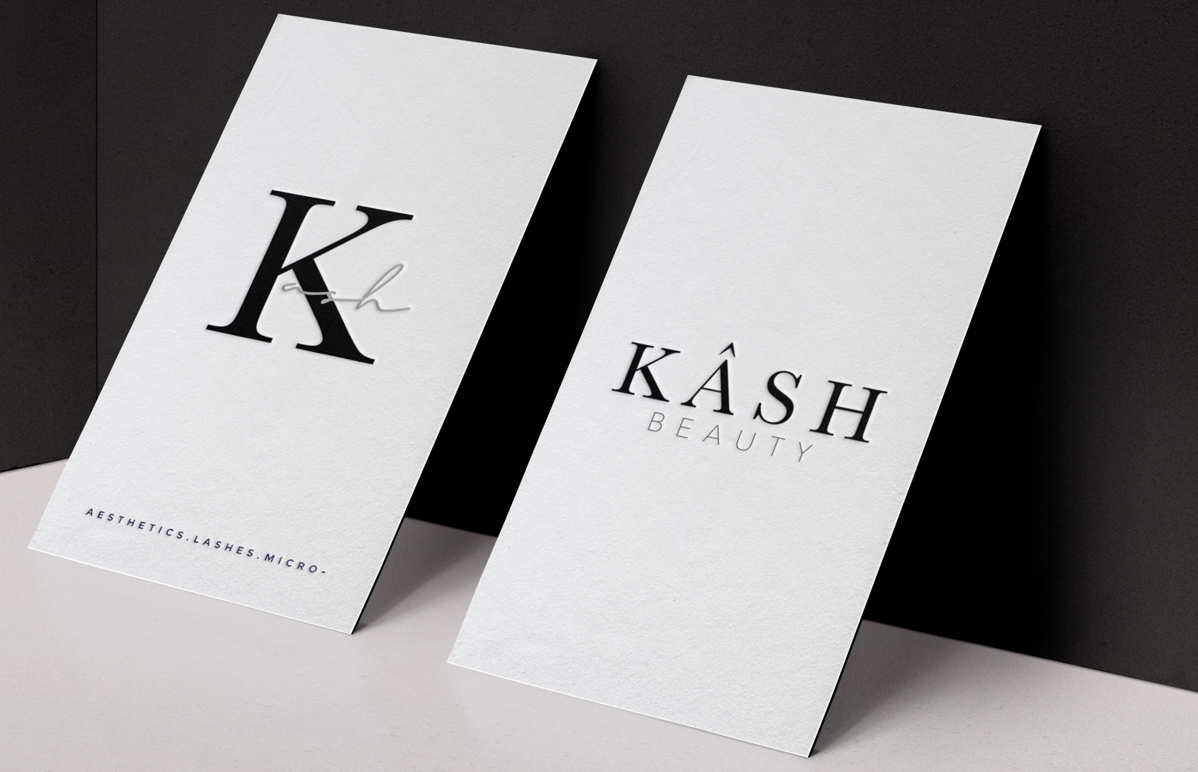
 This project was for a beauty brand created by an amazing esthetician. She wanted something that resembeled a makeup label with the simplicity of a minimal color palette. I think overall it turned out exactly right for her brand. When doing makeup inspired branding, I think using the color black is very important. It gives it a foundation that always looks sleek and refined and then pairing with an accent color adds the pop of interest.
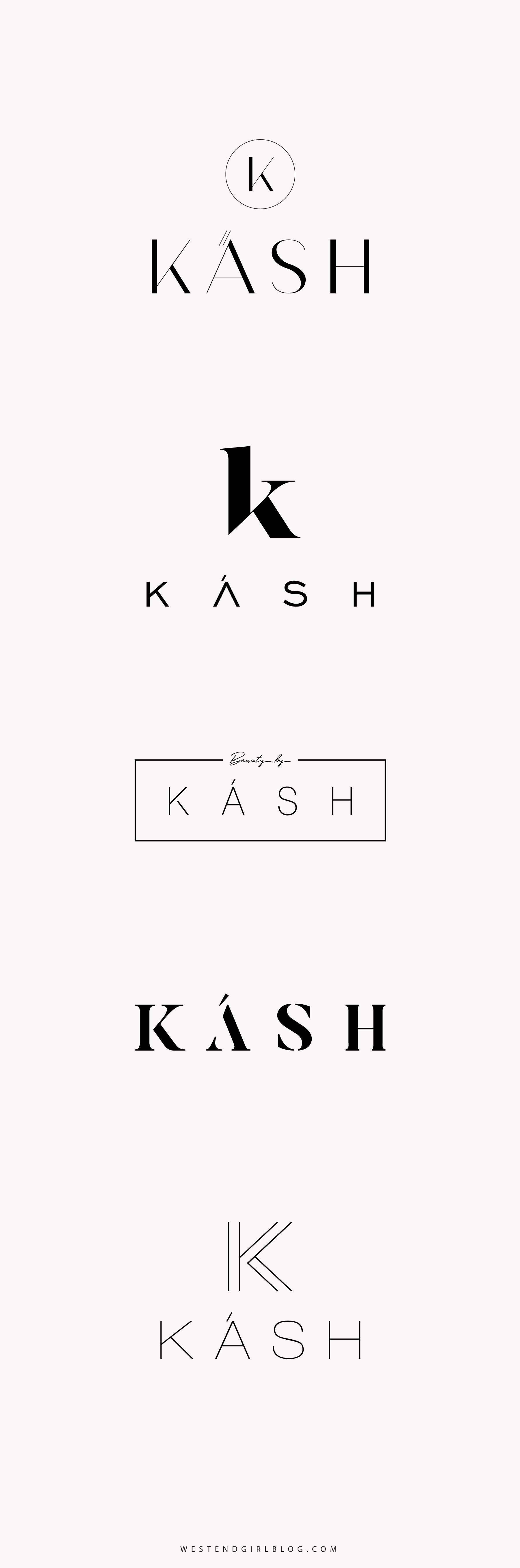
Always consider the longevity of your logo
I will always go in the direction of a simple logo if my client is wanting something modern. The more simple (with a twist of course) the longer it will last. When doing a vintage logo, there is a lot more creative freedom with texture and artwork because you are creating it to already look old which means it will always be vintage.
Designing for amazing clients is something I am always so grateful for. I have been so blessed in 2018 with the awesome brands and people I have worked with and am excited for my new list of clients for 2019.